Fix8 Media Launches New Duda Website for Iron & Grace
Creating an Inviting Online Presence For Iron & Grace with Duda
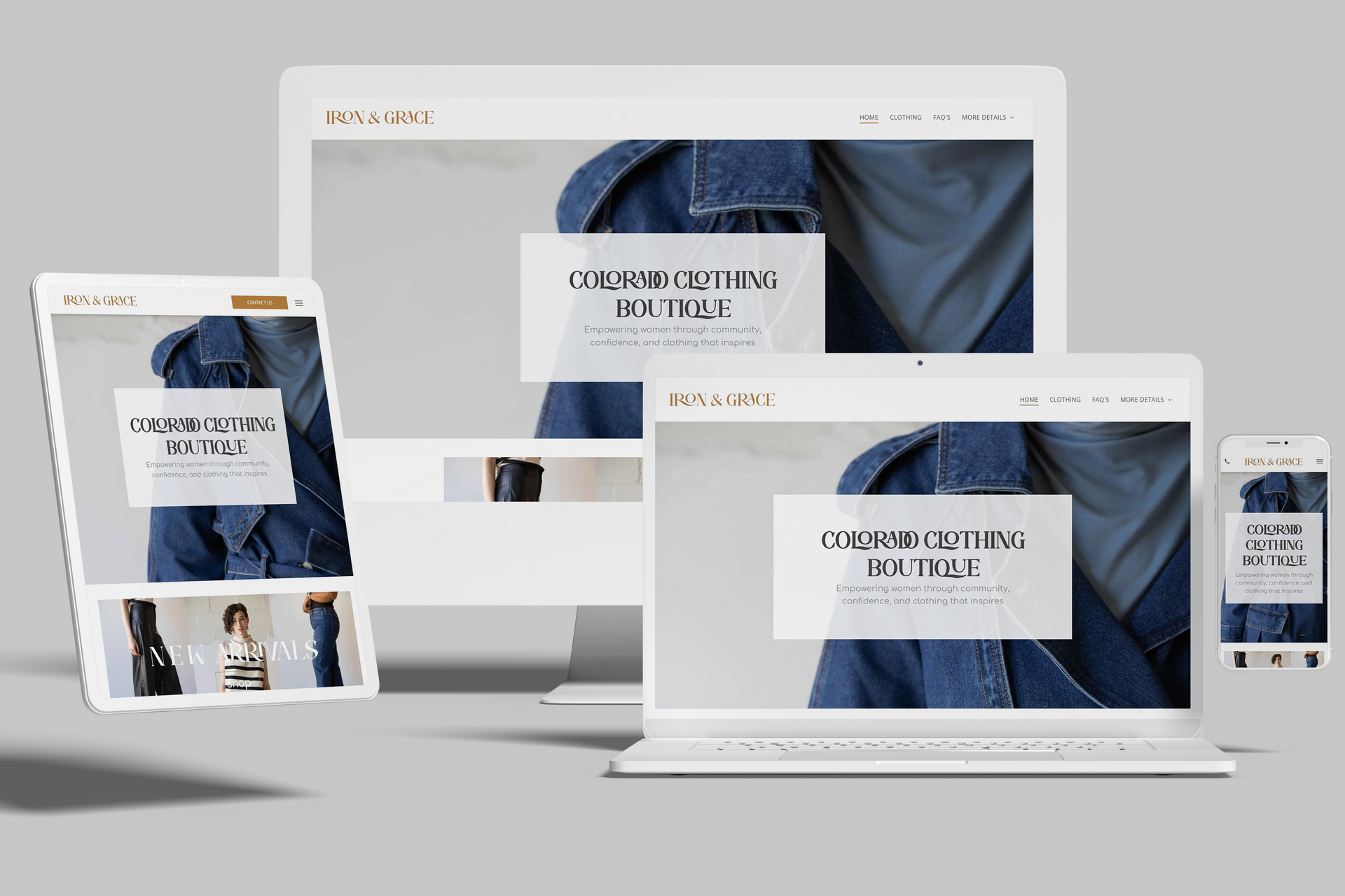
The Iron and Grace website is designed to embody elegance, functionality, and a seamless shopping experience. Tasked with this brand, Fix8 Media created a Duda website that reflects Iron and Grace’s dedication to quality and style, engaging visitors from the first click and offering an immersive experience throughout. Let’s explore the website’s standout features that make it a refined platform for shopping and brand discovery.
At Iron and Grace, first impressions matter, and the full-width banner images across the website are a testament to this. These banners provide an expansive view, each one showcasing the brand’s core aesthetic with high-resolution images that introduce visitors to their unique products. Alongside these banners, the website uses engaging, modern fonts that capture attention while enhancing readability, giving every page a polished look that resonates with the brand’s values.
The color palette brings warmth and sophistication, balancing earthy tones with soft accents that perfectly complement Iron and Grace’s product line. This color scheme creates an inviting environment, helping visitors feel connected to the brand's aesthetic from the moment they land on the page.
Images are central to the Iron and Grace experience, and the website uses overlaying images thoughtfully to add visual depth. This layered effect enhances engagement, making the browsing experience dynamic while drawing attention to new and popular products. The overlays are subtle yet impactful, giving the website a multi-dimensional feel that aligns with Iron and Grace’s dedication to detail.
An extensive image gallery showcases Iron and Grace’s product range, from clothing to accessories, with stunning photos that allow visitors to appreciate each item. This large gallery gives potential customers a clear view of the products in a visually compelling format, creating a sense of connection to each piece before purchase.
Iron and Grace’s online shopping experience is streamlined through a robust eCommerce setup. The product pages feature high-quality images and detailed descriptions, making it easy for customers to explore, learn about, and purchase items directly on the site. A user-friendly shopping cart and secure checkout process ensure a smooth and enjoyable buying journey, with convenient options for payment and shipping. This eCommerce functionality not only enhances user experience but also drives conversions by making shopping intuitive and accessible.
Fix8 Media’s design for Iron and Grace successfully combines visual appeal, functionality, and ease of use, creating a Duda website that reflects the brand’s essence. With full-width banners, an inviting color palette, overlaying images, and a seamless eCommerce experience, this site is a polished digital storefront for Iron and Grace, inviting visitors to explore and shop with confidence.

